HP Content Hub
Website and CMS expertise, deployed at HP scale.
Responsive design is the practice of building one website that adapts its layout to whatever screen it lands on. The same code reflows from a phone to a tablet to a wide desktop monitor, without separate versions for each. One site, many shapes.
It works through fluid grids, flexible images, and CSS media queries that change the layout at defined breakpoints. A three-column layout on desktop collapses to a single column on a phone. Text stays readable, tap targets stay reachable, and nothing requires horizontal scrolling. This differs from adaptive design, which serves a few fixed layouts chosen by device, and from the old approach of building a separate mobile site entirely. A news site built responsively shows a dense multi-column front page on a laptop and a clean vertical feed on a phone, both from the same HTML and CSS. Since most web traffic now comes from mobile and Google ranks on mobile-first indexing, responsive is the default expectation rather than a feature.
The hard part is not making a layout shrink. It is making every size feel deliberate, so the small screen is a real experience and not a squeezed version of the big one.
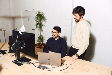
We treat the small screen as the real one. Most people will meet a product on a phone first, so we design and build for that constraint instead of bolting it on after the desktop version looks nice. Responsive web design is not a checkbox at the end of a project. It shapes the layout decisions from the first wireframe.
Our design and engineering work happens together, which is why our responsive builds hold up: the designers know what reflows cleanly and the developers know what the design needs to mean at every breakpoint. When we partner with a brand, the site has to feel as intentional on a commuter's phone as it does in a boardroom demo. That consistency across every screen is what keeps users trusting the product, and it is the difference between web design that photographs well and web design that works.
Site that falls apart on a phone? Let's make it work everywhere.
Website and CMS expertise, deployed at HP scale.
A logistics company that ships to 190 countries built something to ship to itself.
Turning a brand into a working business.